01
Challenge
Tatekan Solutions needed a bold yet understated identity — a brand that speaks power, precision, and trust.
Case study · Branding
Construction · 2021
A precise, monochrome identity for a construction company.
Tatekan Solutions needed a bold yet understated identity — a brand that speaks power, precision, and trust.
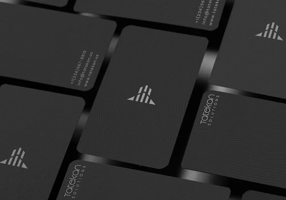
We crafted a minimalist, balanced logo with a dark, sophisticated palette, embodying their corporate strength and modern approach.
The vision was clear from the start — so clear that the first design was approved instantly. A brand built to last, just like their constructions.
Project
You built the company. We'll give it an identity to match.